There’s no denying we’re living in a visual culture. We all love seeing photos and videos, particularly if they are informative, interesting, and relatable. But with so hundreds of thousands of visual content being shared every single day, we all crave to make ours stand out and be memorable. When you’re building your brand on different social media platforms and on the web, it’s necessary to be consistent with the visuals you’re creating.
Weekly mockups, freebies, and free photos
Thank you!
Please check your email and confirm your subscription.
Remember: It’s Not Always About Looks
I used to work for a digital marketing agency and one of my tasks was to create visual content for the Facebook pages of top brands. With a limitless access to thousands of photos, I was always tempted to use a photo I find beautiful. Whenever I did that, the visuals I submit to our clients got rejected.
Obviously, this was my fault because I was just thinking of what was beautiful to my eyes and not what was visually consistent with their brands.
How Do You Know If Your Brand is Visually Consistent?
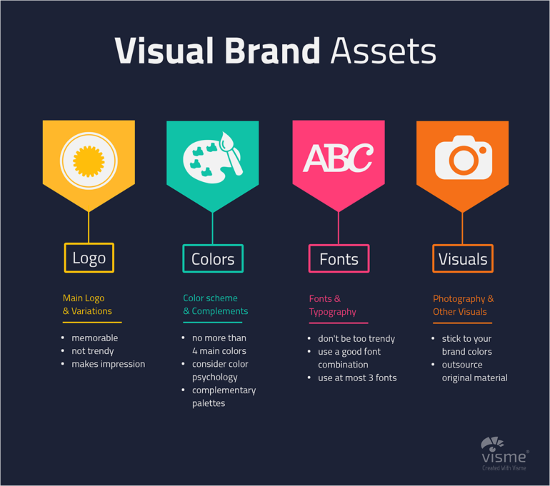
After reading an article by visual strategist Orana Velarde of Orana Creative, I learned that when we’re creating visual content for our brands, we should be consistent with these four visual brand assets: logo, colors, font, and photos.

If you’re using different colors and brand fonts and placing your logo at different places every time you create visual, then you’re not being consistent with your visual branding.
Brands That Are Nailing Visual Consistency
To inspire you and share with you some ideas on how to achieve visual consistency, here are four brands that are always on point and I’m sure you’re also following them on Instagram.
Airbnb
Airbnb is probably in everybody’s must-follow Instagram accounts. Not only do they share beautiful pictures that will really inspire you to travel more but they also promote their valuable users.
Whenever I see this kind of pictures, it always reminds me of Airbnb even if the picture doesn’t belong to them. That’s how well they established their visual branding.
Buffer
When they are not sharing photos of cute animals like these two adorable dogs, they are sharing photos of beautiful places.
You can tell by the pictures they are sharing and the caption they are writing that they want people to help people to be more productive so they’ll have more time to enjoy life and go to more awesome places. Well, at least, that’s what I feel when I see their posts.
Forbes
If you’re on Instagram, you’ll know that quotes aren’t the only thing that Forbes is sharing. They are also sharing photos of influential personalities with quotes as captions and other photos related to current news.
Right now, I want to focus on how they do their picture quotes. With so many funny and relatable quotes being shared on Instagram, Forbes is able to stand out because they always use the same fonts when creating this type of visual and they always put their logo at the center bottom.
In addition, the colors they use are not bright but are subtly dark. Actually, they only use this color of red, different types of blue, gold (please correct me if I am color blind), green, light black (or is it dark grey?), and black.
Orana Creative
Visual consistent with the fonts, photos, colors, and arrangement of her posts. Who else can pull of being visual consistent other than visual strategist, Orana.
If you go over her Instagram account, you’ll see that she always use 2 types of fonts for her text visual content and the colors of the photos she is choosing is coordinated with her posts.
How To Maintain Visual Consistency – Forever
It may be tempting to hire a professional photographer to take original and beautiful photos for your brand but if you’re just starting out with your business and have a small budget, you can always get beautiful, high-resolution images for free on Barnimages.
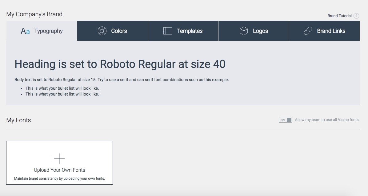
And if you’re really serious about building your visual brand identity, Visme’s Brand Kit tool lets you keep all your visual brand assets – fonts, your brand colors, logos, photos, visual templates and many more – in one place so you and your team will always be consistent with the visuals you’re making.

To Wrap It All Up
Visual consistency helps you stand out on the web and helps you to be easily identified by your audience. It’s not all about sharing majestic pictures, it’s about knowing if your audience can instantly notice you in the sea of millions of visuals.


